The goal of this project was to update an airline check-in kiosk with their new branding as well as simplify and refresh the user experience. I was the lead interaction designer on this project, working closely with my colleagues in visual design, user research, product management, and development.
If you have used this check-in kiosk recently you have used something I worked on!
Design challenge
Two prominent national airlines had merged a few years earlier and their current check-in kiosk was composed of some screens from both companies, creating a slow, outdated, confusing experience with several different templates and generations of branding.
We also had to keep in mind that the computers that hosted the check-in kiosks were old and had technical limitations, and that different airports had different types of technology, so any new designs had to work with all of them.
My roles
Lead interaction designer & assisted research team
Initial research
Observational studies and interviews
The project team (Researchers, designers & product stakeholders) took part in trips around the country to watch customers using the check-in kiosk, observe their pain points, ask them about their experiences, interview employees, and find out how the experience could be improved, not just beautified.
Competitive analysis
We looked at how other airlines were starting to enhance their check-in kiosk experiences from the old, traditional 1990's website style.
Design process
In order to tackle this large and complex project I first analyzed the existing application to figure out the current flow and any opportunities for improvement.
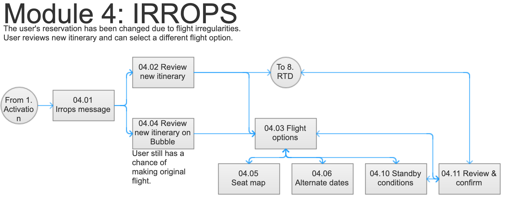
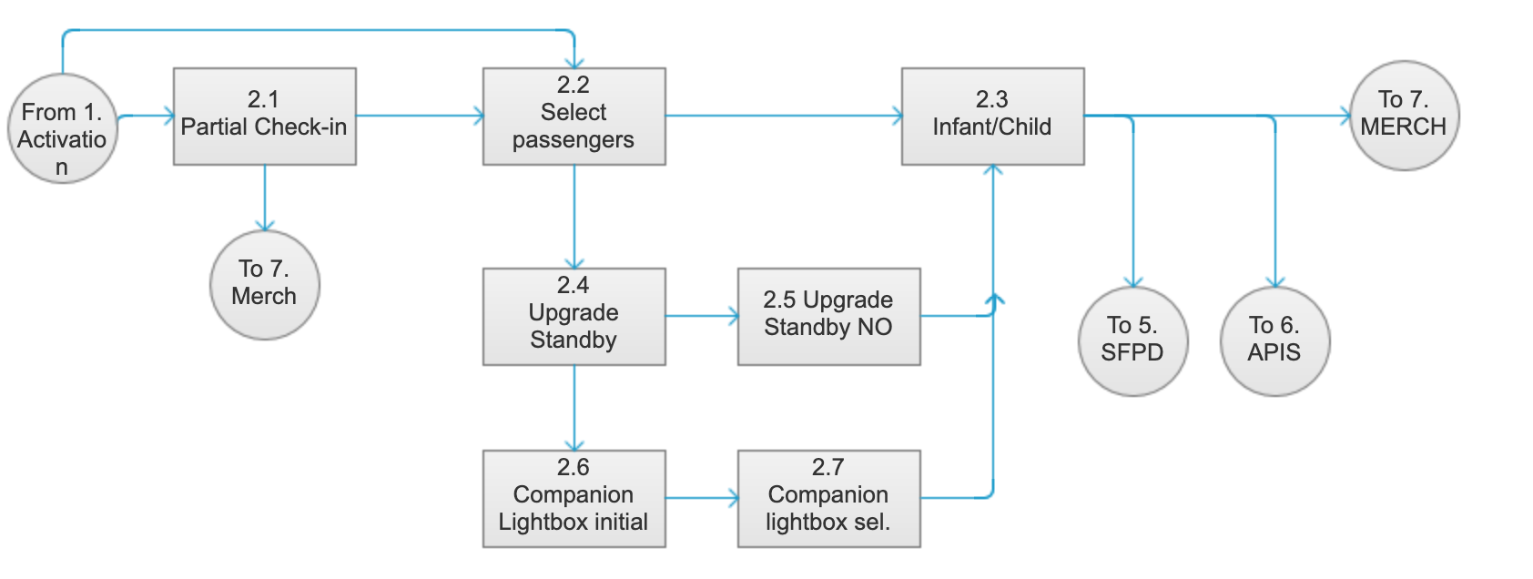
I broke the current flow down into segments (Kiosk activation, passengers, bags, upgrades, etc.), identified each step, and mapped how each segment linked to the next one. This gave the team a bird’s eye view of the entire process. I also introduced a numbering pattern to allow us to track each screen.
Here are some examples:

Then I looked for areas in the existing flow that could possibly be simplified, and discussed them with stakeholders to determine feasibility.
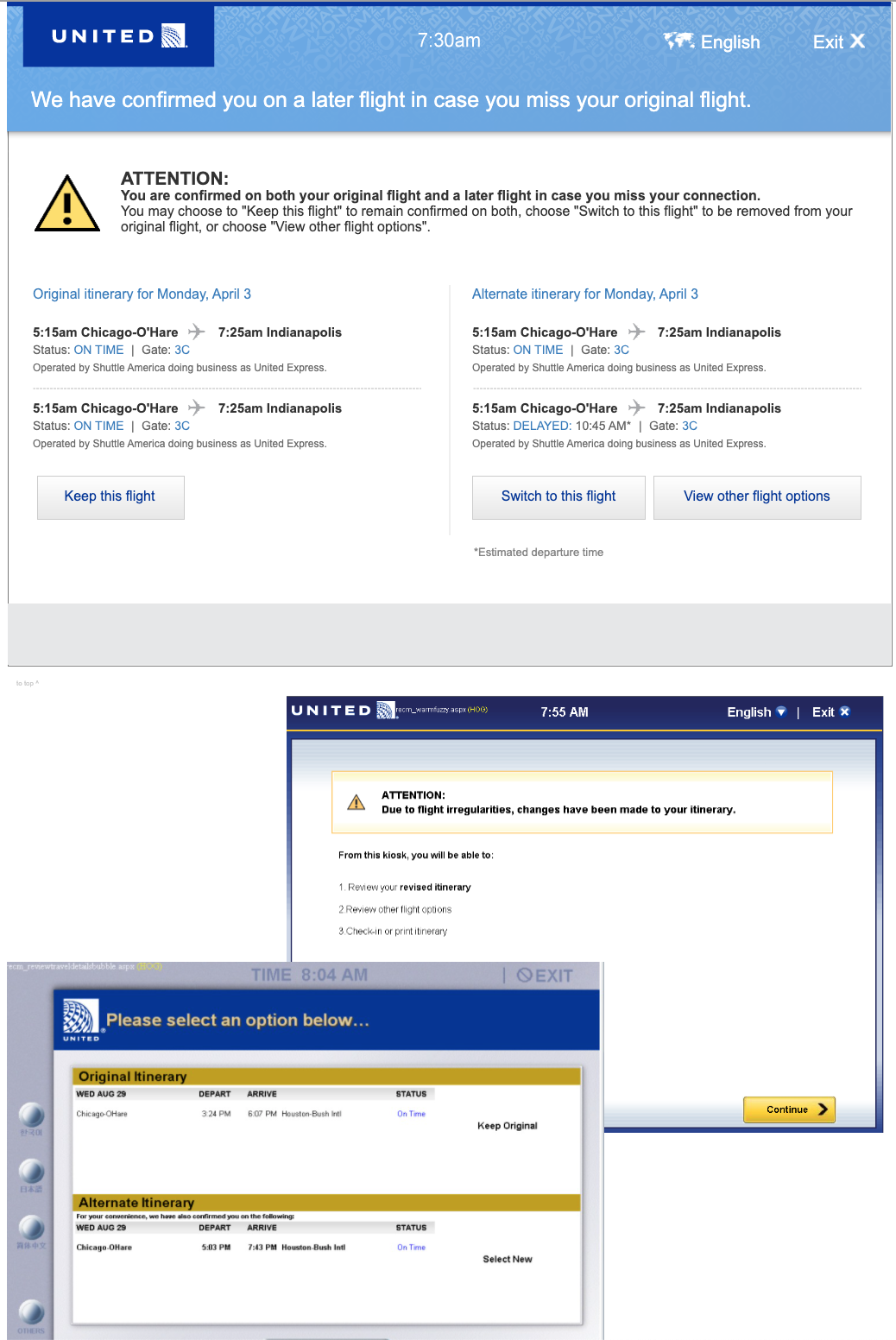
For example, the flow for selecting passengers originally included a separate screen for viewing passengers who had already been checked in. This screen turned out to be unnecessary.
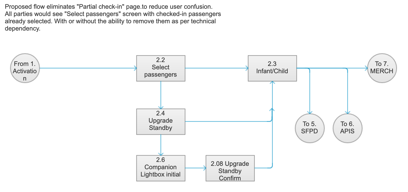
At the same time we worked on finding a single page layout that could be applied consistently to every page in the flow.
We also did user research, visiting several airports throughout the US to observe and interview users and check-in agents using the current experience. We learned everything we could about the many conflicting sets of requirements: for users, agents, regulations, airports, and the business. Once the design was in place we did lab-based user testing to ensure it was easy to use with no help.
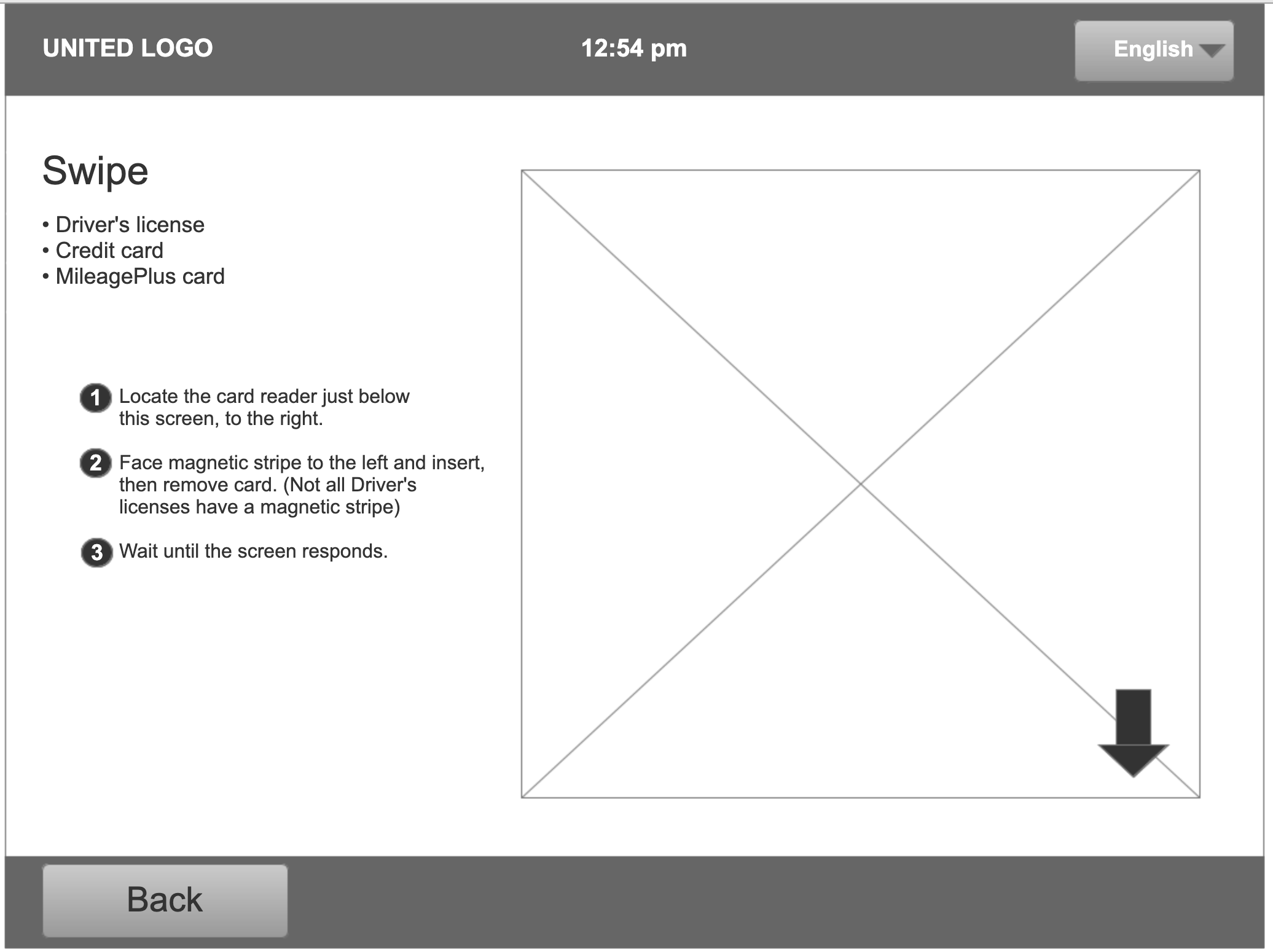
One of the improvements we added based on research was building in instructions to let the user know how to swipe or scan their travel documents. We determined a technically feasible way of providing these instructions which previously did not exist.
Testing
For this project we did in-person, lab-based, moderated user testing.
The researcher conducted usability tests using the Axure prototype that I made. He had the participants walk through the check-in tasks and provide their feedback. I and the other designers took notes, and then we evaluated the results as a team.
Testing conclusions
- Participants noted that grey buttons said "Disabled" to them, so we steered clear of the use of grey in the final visual design.
- We noted where language was ambiguous or could be made more precise
- We noted where screens were too busy and had too much content for the participant to make sense of quickly; then we thought about ways to simplify.
Deliverables
I created a fully interactive Axure prototype that contained every page in the flow so that it could be demonstrated and tested. I worked on the prototype in iterations, updating each page from basic wireframes to detailed visual design.
I created the prototype so that it could be navigated using multiple scenarios to ensure that the flows were versatile and complete.
This let us consider each new segment that we worked on in the context of the entire flow that the user would be experiencing.
I decided to place screenshots from the existing application below each screen to let stakeholders understand the changes we were proposing so that they could determine feasibility. It also helped the development team understand the scope.